
Progress Tracking
The Pill Club
Role/Team
Myself (Product Design Intern)
Margaret Sommers (Manager/Senior Designer)
Myself (Product Design Intern)
Margaret Sommers (Manager/Senior Designer)
Tools
Fullstory, Figma, Zeplin, Jira
Fullstory, Figma, Zeplin, Jira
Duration
3 weeks, 2021
3 weeks, 2021
Project Overview
During my time at The Pill Club, I redesigned two components within the company design system: onboarding and dashboard progress trackers. I was responsible for conducting a competitive analysis, an audit of the existing components, and created a high-fidelity interactive prototype using Figma based on my research.
Goals
My central goal in this project was to create a redesign that improved accessiblity and allowed the visibility of system status, which is a central usability heuristic. “When users know the current system status, they learn the outcome of their prior interactions and determine next steps. Predictable interactions create trust in the product as well as the brand.” (Jakob Nielson, Nielson Norman Group)
Research & Analysis
Auditing Current DesignI chose to work on these components because it was a point of friction for me as a user when I first interacted with the companys’ product. As a user with challenges in mainting focus for long periods of time, I found both the progress tracker of the onboarding flow and what’s next components to be unhelpful and confusing. Through visual analysis and review of users’ behavior in fullstory, I was able to determine pain points that my design would focus on.
To understand how these features might be redesigned and improved, I needed to have an in-depth and clear understanding of the purpose and uses for both components. I met with members of the engineering team that worked on the implementation of these features to bridge the gap in my understanding.
 Heat maps indicating “dead clicks”
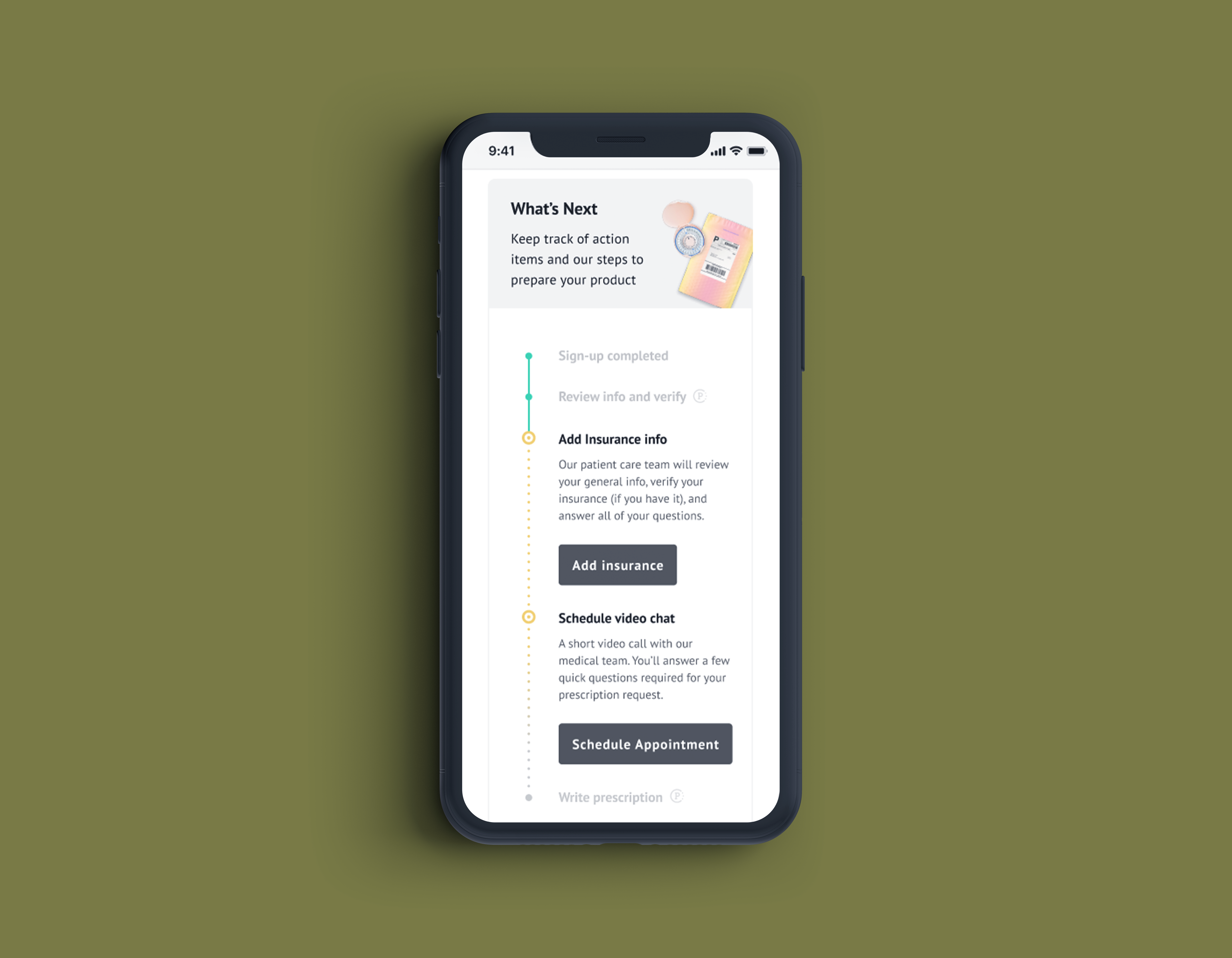
“What’s Next”: Dashboard Progress Tracker
Onboarding Progress Tracker
- Common “dead-clicks”, What’s Next component uses a similar UI to the radio bottons/mutli select in the funnel which are clickable
- No visual differentiation between user tasks and what The Pill Club is doing behind the scenes --> both are included in the component
Onboarding Progress Tracker
- Common “dead-clicks”, users are unsure how to interact with the tracker and might be looking for more information
- The length of the bar only represents progress for current section
- Little context as to what actions have been completed in past sections and what future sections are remaining while onboarding
- Users have no idea how much longer they have in the questionaire overall which is useful especially for users with attention defecits
- Low contrast/visibility of funnel tracker --> not accessible
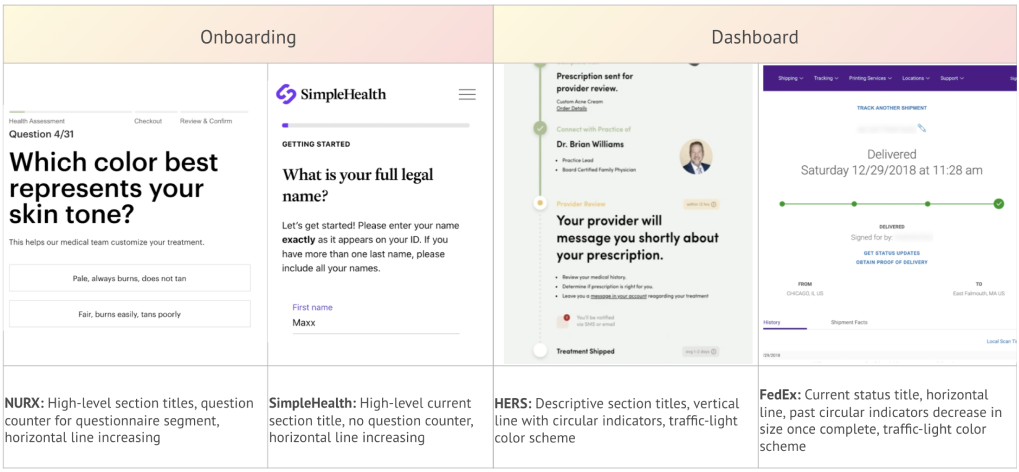
Competitive Analysis
I identified a few direct and indirect competitors who displayed different examples of progress trackers. I analyzed four companies in depth and noted a few key insights from their components below.
Brainstorm and Design Exploration
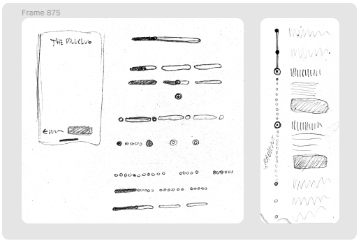
Paper explorations

Onboarding progress tracker design variations

What’s Next progress tracker design variations
My Solutions
Onboarding Progress Tracker
Live prototype in figma (clickable)
Live prototype in figma (clickable)
Dashboard Progress Tracker
Live prototype in figma (clickable)
Live prototype in figma (clickable)
Deconstructing the Components
Funnel Progress Tracker
What’s Next Progress Tracker


Reflections and Next Steps
This project was the most challenging and therefore the most gratifying to complete. As a designer I have a passion for accessiblity, with the freedom to choose my project I was able to tackle a challenge that improved the overall user experience. Through meeting with key stakeholders such as engineering and brand, I was able to reach a solution that was well accepted and feasible for implementation.
My biggest takeaway from this project was learning the value of my perspective, even as a junior designer. The progress tracking component was an element of the design system that I felt passionate about before my internship even began. To prepare myself for the role I audited the onboarding process and took note of what stood out to me on each screen. Being able to express my concerns and be heard by my managers was reassuring and validated that I have something valuable to bring to the table, my perspective as a user.
Of course as a designer I value perspectives beyond my own. If I had the opportunity to continue working on this project I would conduct user testing and make sure to include users with potential visual, hearing, motor, and cognitive disabilities. An inclusive design mentality is imperative to having a usable digital product.
MXD Media 2024