
Create Account Redesign
The Pill Club
Role/Team
Myself (Product Design Intern)
Nurah Ali (Product Design Intern)
Margaret Sommers (Manager/Senior Designer)
Elaiza Clemen (Manager/Senior Designer)
Myself (Product Design Intern)
Nurah Ali (Product Design Intern)
Margaret Sommers (Manager/Senior Designer)
Elaiza Clemen (Manager/Senior Designer)
Tools
Fullstory, Figma, Zeplin, Jira
Fullstory, Figma, Zeplin, Jira
Duration
3 weeks, 2021
3 weeks, 2021
The Challenge
Working alongside fellow design intern, we were tasked with creating updates to the create account flow. Through a review of the intake process, using an analytics tool fullstory, the product team identified a trend of users dropping off the create account flow to navigate to our brands page.
We each created a user flow that incorporated branding and usability improvements. Together we compiled a competitve analysis and designed high-fidelity interactive prototypes in figma. Our central goal in this project was to reduce the amount of user drop-offs and increase customer attachment.
Goals
🎯 Reduce the amount of user-drop offs ➡️ increase conversion rate
🎯 Get new users excited about our products ➡️ build trust, increase customer attachment
🎯 Avoid cognitive overload during a lengthy onboarding process
Research & Analysis
Learning from TPCBefore making adjustments to the create account interface, my team and I audited the current product (as of 8/13/21) and identified painpoints that we would address in our design process.
➡️ Multiple input fields at once can increase cognitive load
➡️ Users are told that their information will be stored, but we recieved feeback from customer support that not enough trust is created between the company and the consumer
Competitive Analysis
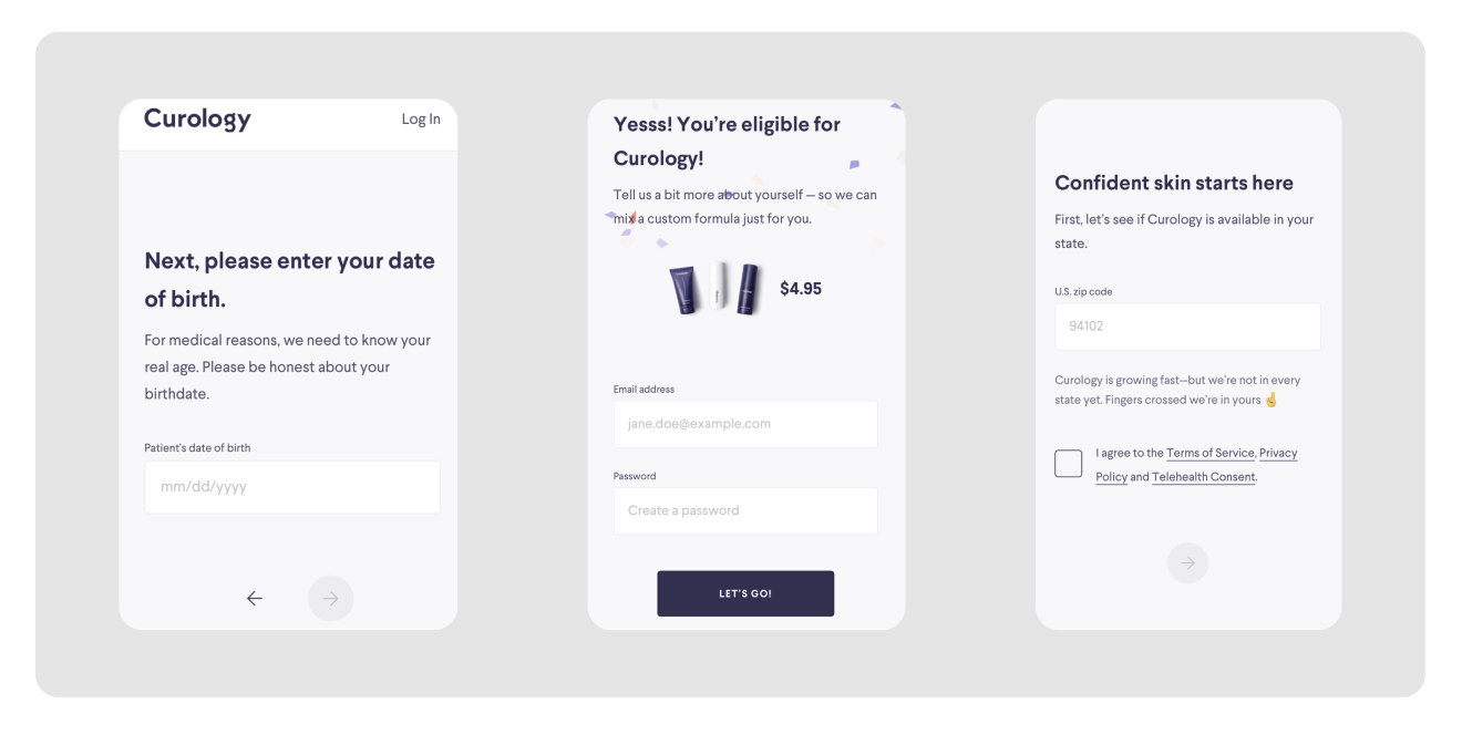
As an additional research step, we analyzed the onboarding flow of our direct and indirect competitors. We took note of our observations and highlighted key interactions.
Simple Health
- A new question appears after completion of the previous input, without changing the page
- Sign up completion after telemed questions

-
Modal with list of brands eliminates the need to click out of the onboarding flow
- Eligibility questions are spaced out on multiple pages
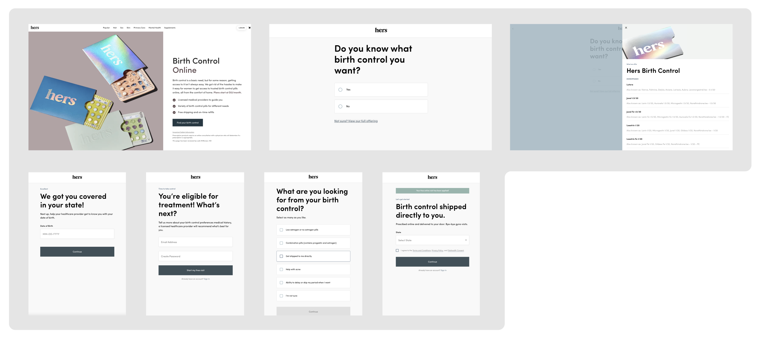
- Use product images on create account page
- Conversational language is used throughout the copy on create account screens
User Flows
After completing the competitive analysis, moved team moved on to thinking through possible “create account” user flows. We mapped out two different flows to go through A/B testing.

Brainstorm
Using free iconography from the internet and design system typographyI put together low-fi examples of my user flow ideas directly in Figma.
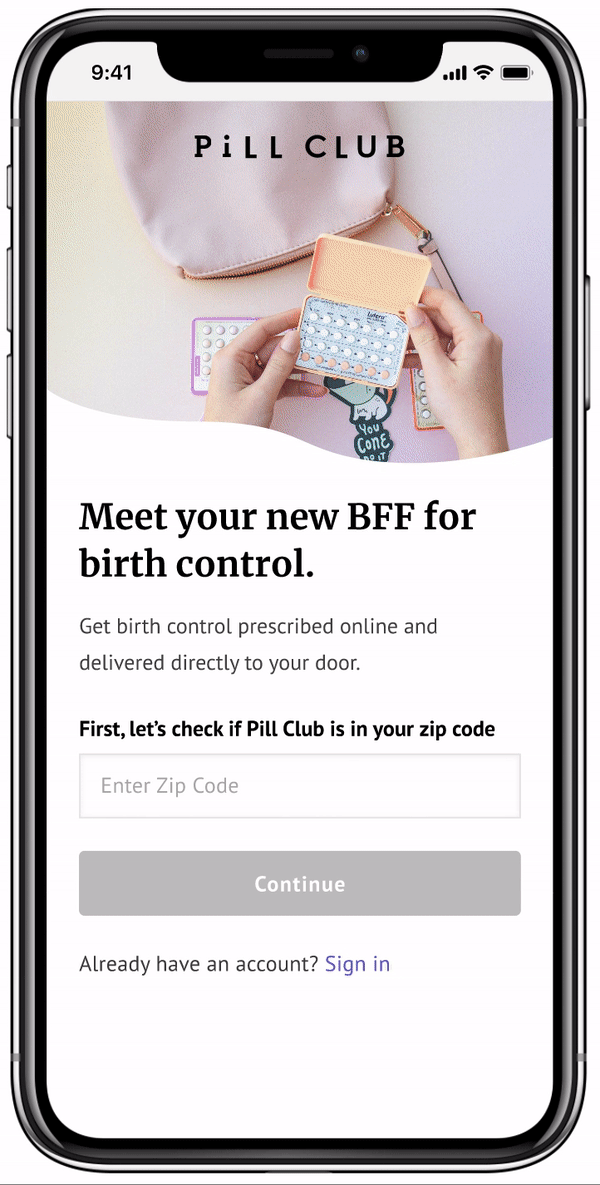
The Solutions
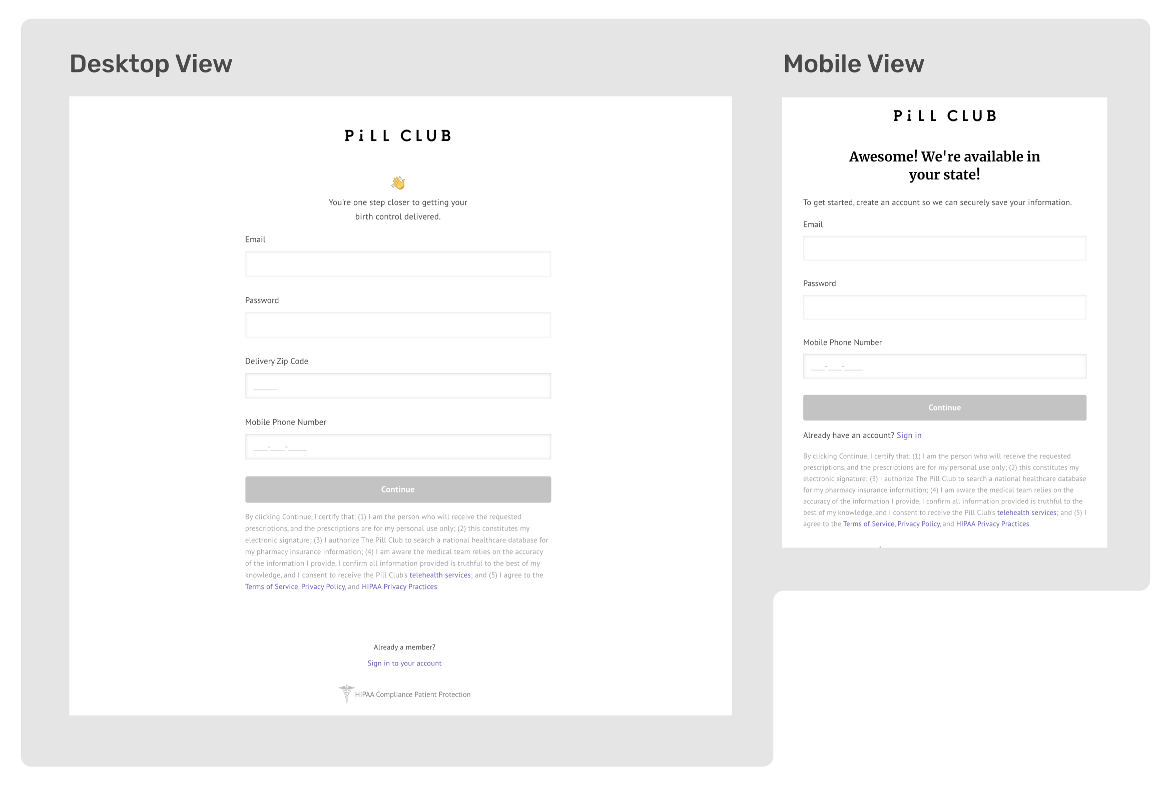
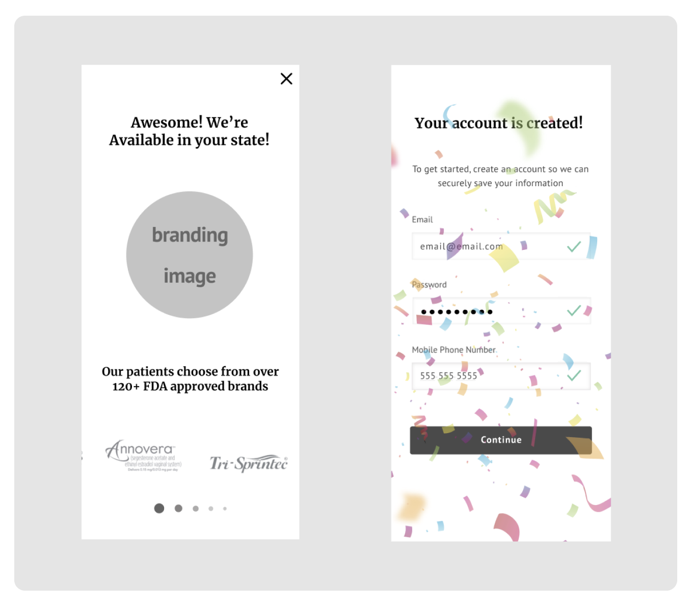
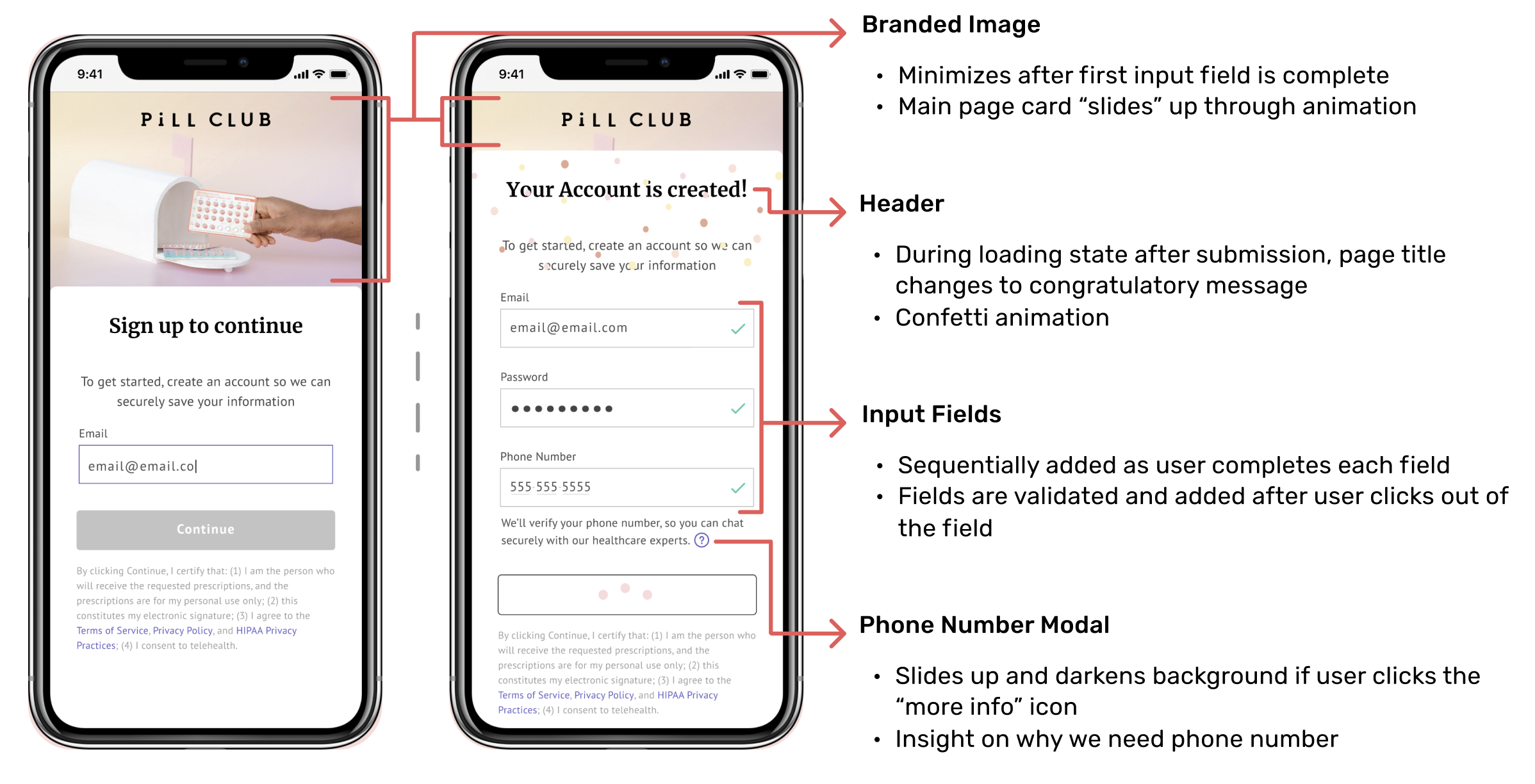
My solution's (prototype A) aim is to make the “create account” process more seamless and intuitive for users. We decided to tackle this by consolidating the screens to ease the cognitive load for the user. My fellow intern focused on prototype B which spaced out each input field. Additionally it featured a component I developed which provides a more in depth look at all the birth control options offered at TPC. In contrast, prototype A showed a concatenated view of the brands we offer.
Gif of Prototype A
Gif of Prototype B
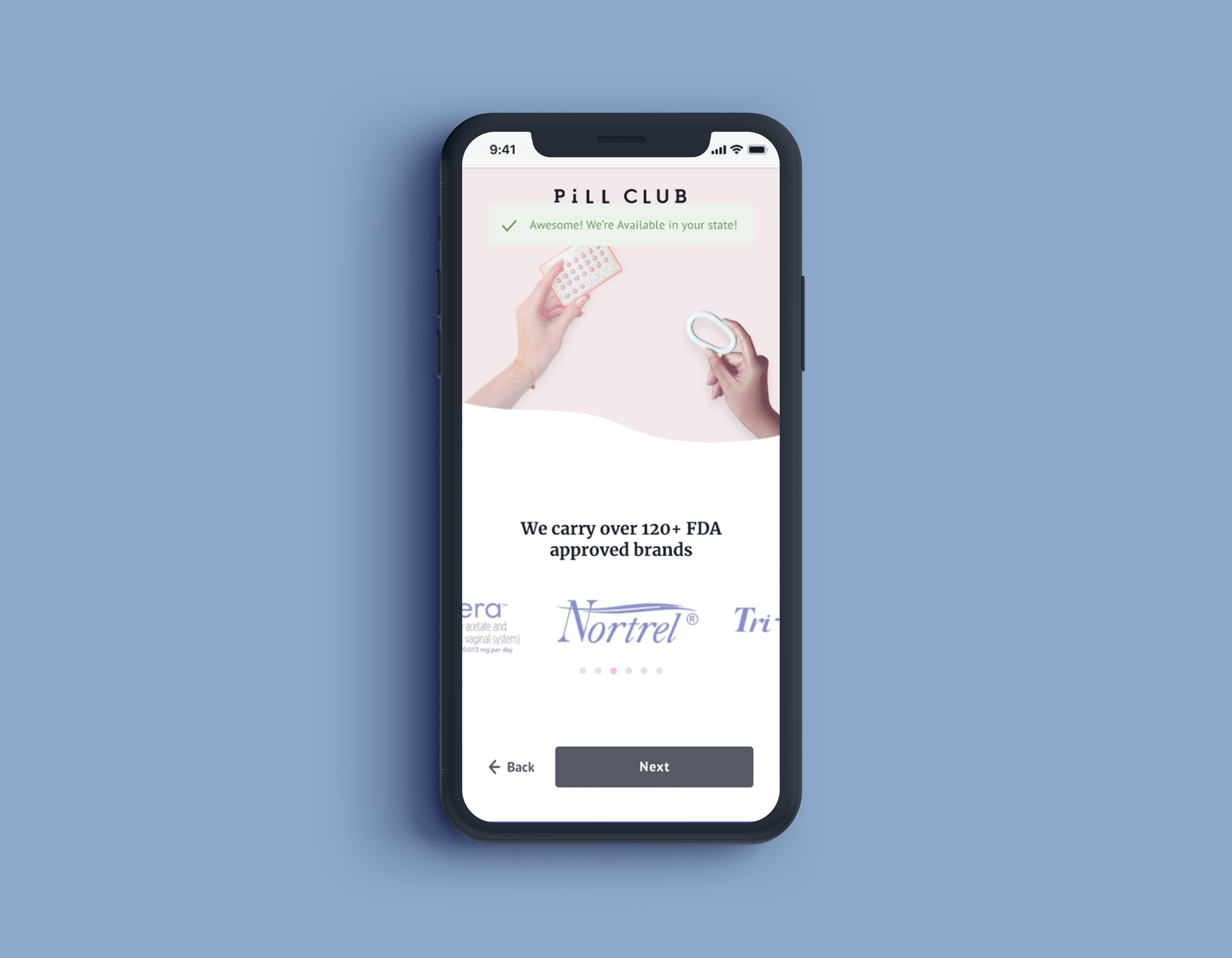
Deconstructing Prototype A
With this flow, the user can focus on one question at a time with sequential input fields. We also incorporate branding early on to engage the user and establish reputability by showing that we are FDA approved and carry 120+ birth control options.
Branded Interstitial

Sequential Input Fields
Reflections and Next Steps
As a collaborative project, I enjoyed brainstorming with another person and developing a plan for the design sprint. Although we split responsibilites at the high fidelity design phase, both of our ideas became part of both experiences. I enjoy working on onboarding flows because it is an opportunity to design for complex interfaces that transition between mulitple topics quickly. By centering usability and user needs, we can create expereiences of ease.
After the internship, our designs were tested in product as an A/B test. If I were apart of the testing phase, I would have specifically looked out for how users interacted with the components pertaining to the brands TPC offers and the input fields. In the end I wonder if having sequential input fields improved the ease of use.
MXD Media 2024