
![]()
SCOOL
BVCC UX Pitch Competition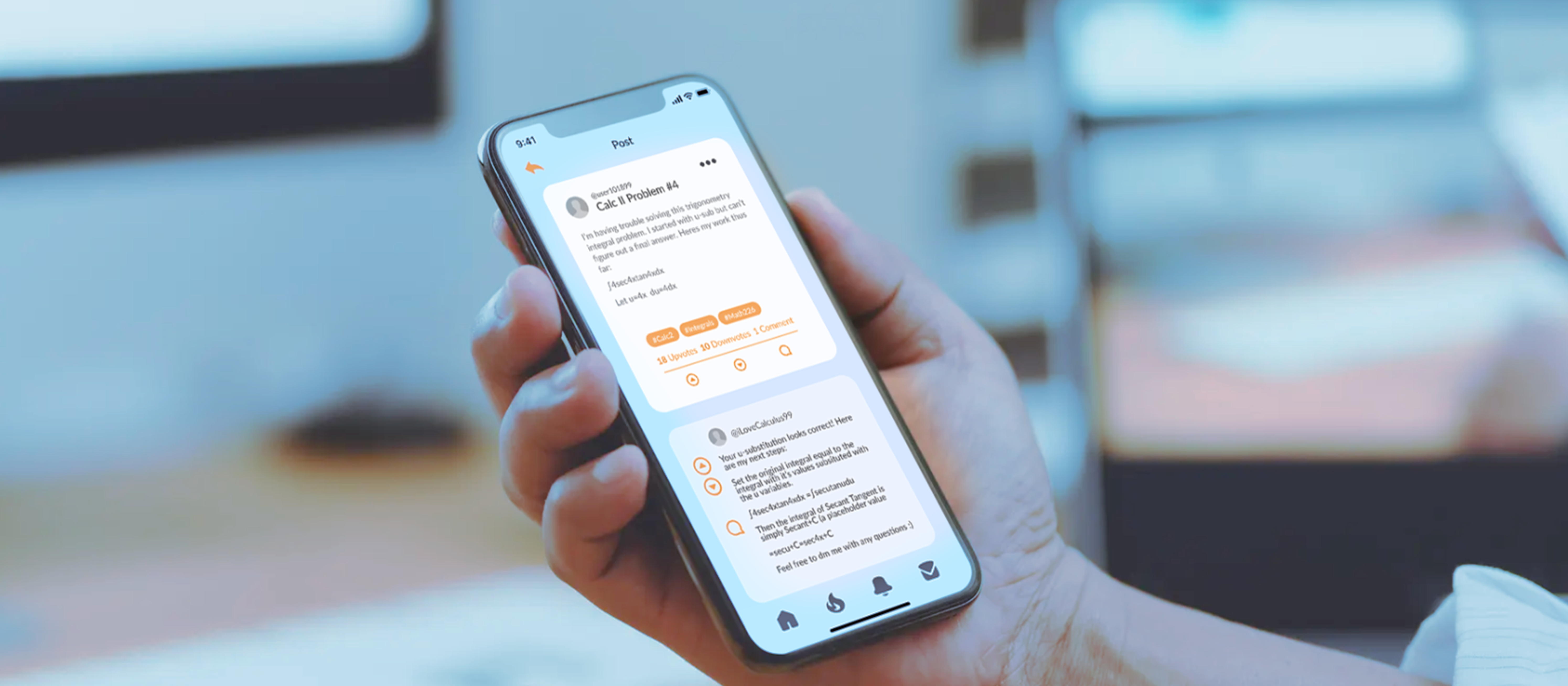
Role/Team
Myself (UX Lead)
Emmanuel Daniel-Aguebor (VC Lead)
Payton Dennis (SWE Lead)
Myself (UX Lead)
Emmanuel Daniel-Aguebor (VC Lead)
Payton Dennis (SWE Lead)
Tools
Figma, Adobe Illustrator/Photoshop, Zoom
Figma, Adobe Illustrator/Photoshop, Zoom
Duration
3 Months, 2020
3 Months, 2020
Project Overview
Scool is a product that leverages current college students to answer other college students’ questions and provide support with campus-specific subject matter. My role as UX lead encompassed preparing a medium-fidelity prototype for a pitch competition of ed-tech applications, hosted by BVCC (Black Venture Capitol Consortium). I joined the team after the problem was defined and was brought up to speed in the ideating phase.
The Problem
Students are unable to get help for their classes or in understanding concepts at the exact time they need it because the current tutoring system is inefficient and unreliable. The pandemic environment only exacerbates gaps in students’ learning.
Rapid Reserch
Intercept InterviewsBefore embarking on the prototyping phase of our product, we wanted to get to know our target audience, their study habits, and challenges with accessing academic support. College students often have access to on-campus tutoring resources and office hours in addition to information on the world-wide-web. To collect diverse perspectives within our audience, each teammate interviewed two friends with different majors and from schools of varying sizes and demographics.
Key Insights from our Interviews:
- Students are very likely to go online for help with questions whether or not it is allowed
- On average 1.5 times a week students can’t find help online at an inconvenient time (i.e outside office hours)
- Common platforms don’t have an effective search component, making it difficult for users to find specific topics
- In general, these platforms contain outdated information. Quizlet specifically doesn’t allow users to look at a single piece of information without reading through each card
- In all cases, tutoring services were not utilized by students especially in the virtual environment
- In some cases, tutoring is not offered for non-intro more difficult courses
- In some cases, students have anxiety when reaching out for help
- In all cases, students found learning in the virtual environment more difficult
Design Preparation
Information ArchitectureDuring the initial ideation and brainstorming phase we focused on our central quesion and key insights found during rapid research:
“How might we help students study and answer academic questions in a short time frame?”
💥️ Users may experience anxiety when reaching out directly for help
💥️ Users frequently need timely answers outside of business hours
💥️ Users need to be able to search for specific topics
💥️ Users frequently need timely answers outside of business hours
💥️ Users need to be able to search for specific topics
Given these considerations and our targent audience of 18-30 year old students, we decided to build a social media platform with a comprehensive search/filtering feature. Users can shift between a “global feed”, allowing users to ask questions that all users on the platform can answer, and “local feed”, intended for questions about specific courses or administrative events at the user’s school.
In addition to targetting users needing academic support, we also need to motivate users to answer questions. Instead of charging students for our services, we implemented a bonus system incentivizing knowledgable students to answer questions in exchange for coupon rewards.

Visual Identity
After producing the application’s flowchart and a design brief with my team, I created this design system integrating Schools’ brand and solution.

Selecting the swatch was my first step in assembling the system, followed by logo design, typography, attributes, and iconography. I selected the elephant motif since it is associated with knowledge and memory, blue is associated with education and knowledge while orange is its complimentary color. Icons and logos were designed in adobe illustrator. The sans serif font (Marcellus) was not used beyond this system, only the Lato type is in the final wireframe. This design system was my starting point when resolving design challenges during the wire-framing process.
Prototypes
Medium Fidelity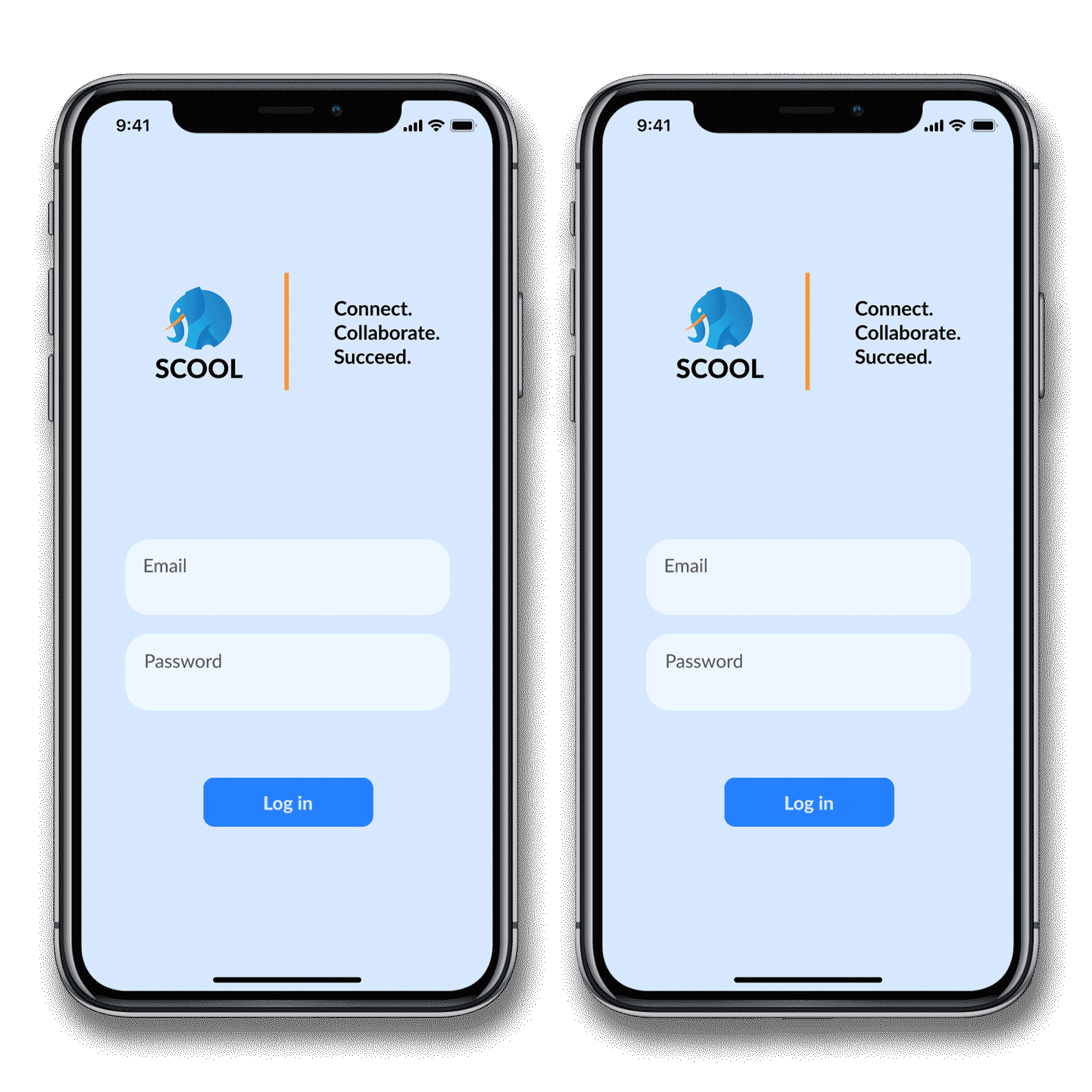
Medium Fidelity
At this stage all placeholder icons and images were replaced. We simplified the navigation bar by replacing the “trending” page icon with a button that switches the feed from “global” to “local” feeds without switching pages. This feature is similar to the “following” vs “for you” feed options recently adopted by X (Twitter).
At this stage all placeholder icons and images were replaced. We simplified the navigation bar by replacing the “trending” page icon with a button that switches the feed from “global” to “local” feeds without switching pages. This feature is similar to the “following” vs “for you” feed options recently adopted by X (Twitter).
Live prototype in figma (clickable)
User Testing
To prepare for testing we created a briefing for users that included the scenario of use for the product and 9 main tasks for them to complete. Our scenario was, "You downloaded this app to help you with questions related to your college coursework. This application allows you to post questions to your local school feed or the global scool user-base based on your preference. Assume you are already logged into the application. "
Without providing specific instructions to the user we identified these tasks:
- “Navigate to a post's thread”
- “Reply to a post”
- “Navigate to global feed from local”
- “Save a post”
- “Compose a new post”
- “Add post to global feed”
- “Navigate to a post from its notification”
- “Create new (direct) message”
- “Check status of bonuses”
The usability issues detected:
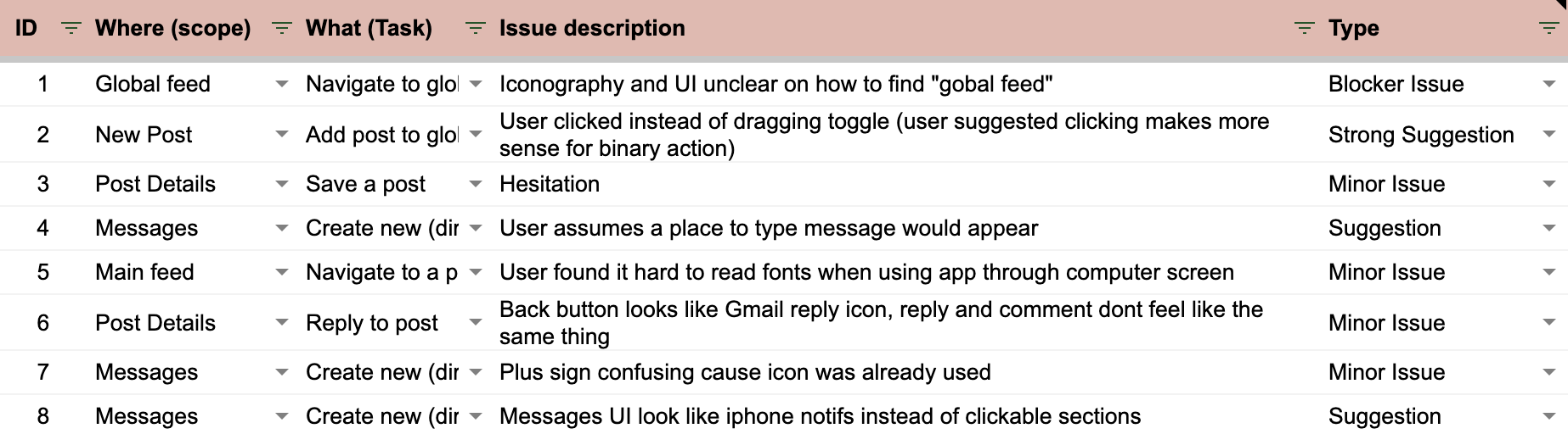
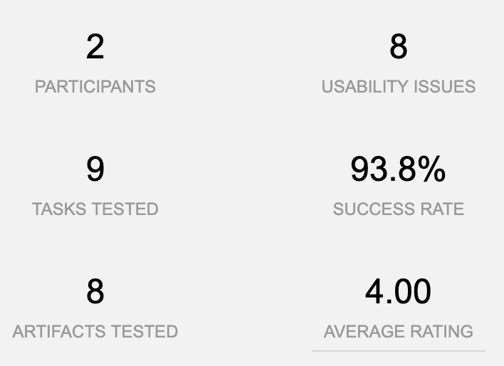
Both of the users that we tested were in their 20s and enrolled at Ivy League Universities. The users were able to complete every task except the 3rd task of navigating to the global feed, which was a blocker issue for both users. The other usability issues mostly related to the icons and UI design choices. Below are the overall results of our testing.

Reflections and Next Steps
After testing our high fidelity prototype the team concluded our work on Scool. If we continued with the project, the iconography choices and UI would be re-designed to address the issues highlighted during user testing.
The UX design and pitch was well received by judges on demo day, we were selected to move forward with the competition but declined participation to participate in our summer internships. I enjoyed working with SWE and venture capitol students to learn about the process of ideating a solution and pitching to investors. As my first ever UX project, I wish I documented more of the brainstorming and design thinking process.
MXD Media 2024